Sneak Peek: Elephant's Future
A lot of visual changes are coming: The landing page, side menu, and some others.
A lot of much more visible changes are coming.
I want Elephant to become easier to use, faster for early users to get something out of it, and prettier.
To achieve this, I reworked the side menu, early interactions and the landing page, and added a starting test to determine the level of a user.
Let’s start with the easiest change, the new side menu.
Side Menu Rework
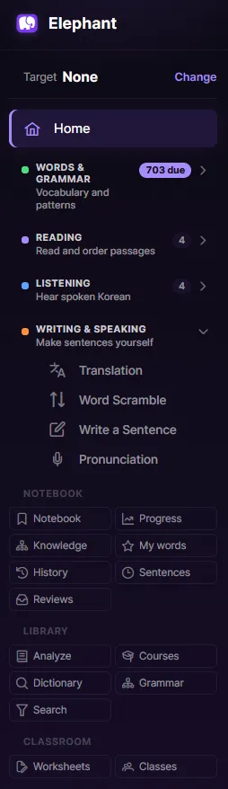
(Please disregard the 703 due reviews on my testing admin account.)
At the top, you can quickly change the study target: currently a level of TOPIK or the standard curriculum.
The task section is split into 4 sections: Words & Grammar, Reading, Listening and lastly Writing & Speaking. These group tasks to work on the respective skills.
The notebook quick buttons help you to get a view of your progress or feedback you’ve received, things you have done and more.
The library gives you access to the things Elephant knows: Sentence analysis and search, the dictionary and grammar list.
Classroom
Lastly, a preview of the classroom features that have little support yet: Centralized worksheets (collections of tasks) and classes, for teachers or study groups.
Entry Test
To enable a faster start with Elephant, I will introduce a level test.
This test will try to determine your placement in the standard curriculum. You do not have to accept the result and you can overwrite your placement with the self-picked target.
It will set words and grammar you should know, so you can start exercising.
Website Redesign
The current landing page fulfilled its use, but it was never particularly nice.
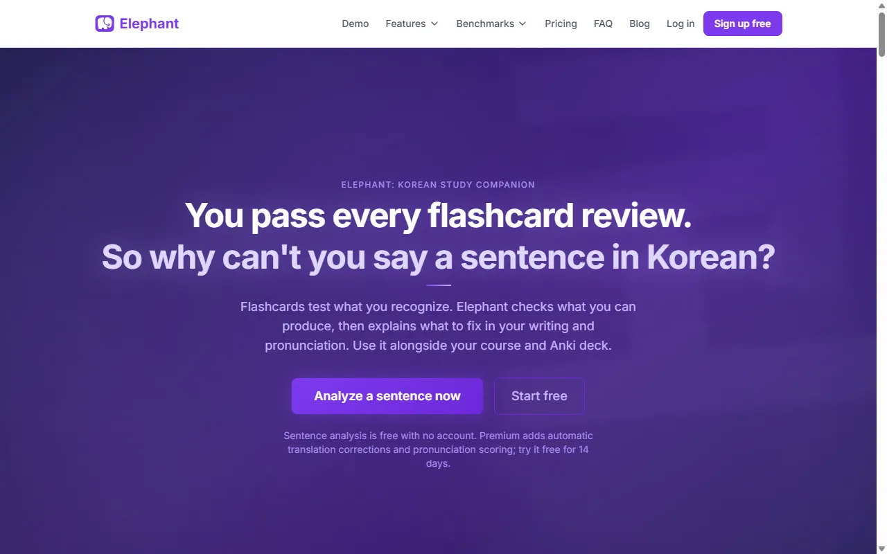
Elephant is a workbook. So I wanted the site to lean more into the aesthetic.
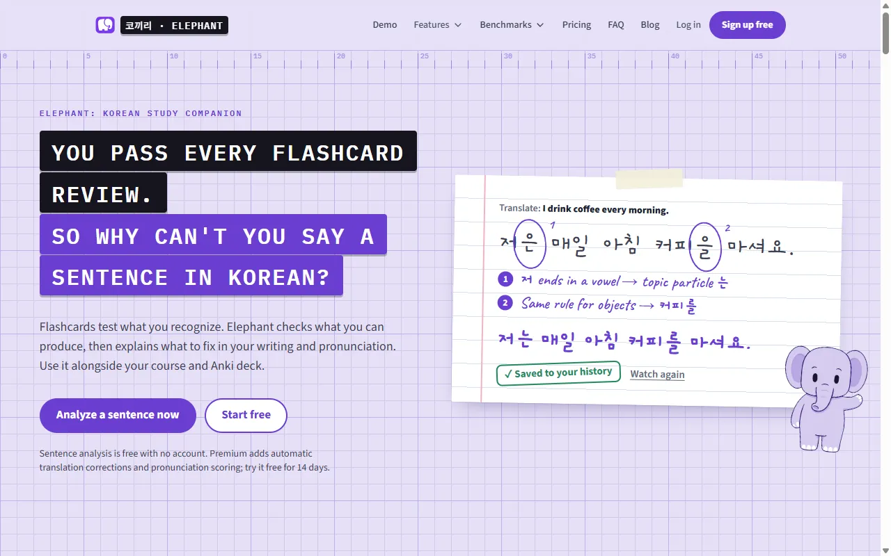
All other pages move to this design as well, including the benchmarks, which turn into a printed report:
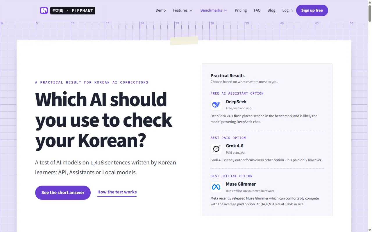
This is limited to the website; the app itself will stay on the less distracting design.
The mascot is a placeholder, until I find an artist I like working with or learn to draw better.
Future Tasks: Dialogs and Longer Text Passages
Longer exercises are implemented, but not available for some time.
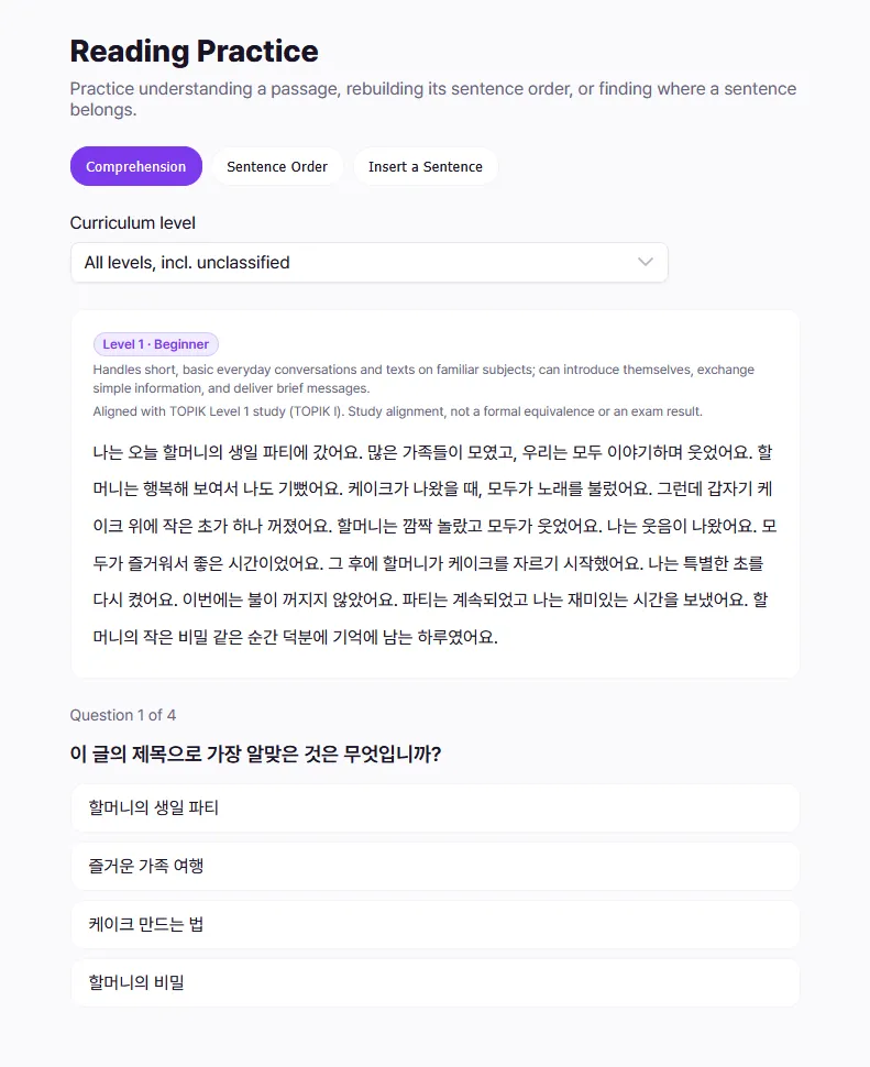
Dialogs and passages have a set of tasks associated with them: Reading and listening comprehension, inserting a sentence, and more.
The limiting factor right now is content writing. I would like to avoid LLM-generated content, so I am looking for educational writers. Once we have enough content, the tasks will go live.
I am happy to hear your thoughts on the plans!
David
Comments